Scroll Down
Scroll Down
Scroll Down
The Intention
To go beyond the creation of a residential complex in order to open an authentic space in Prague that emphasises the exceptional quality of the residences and of the locality itself.
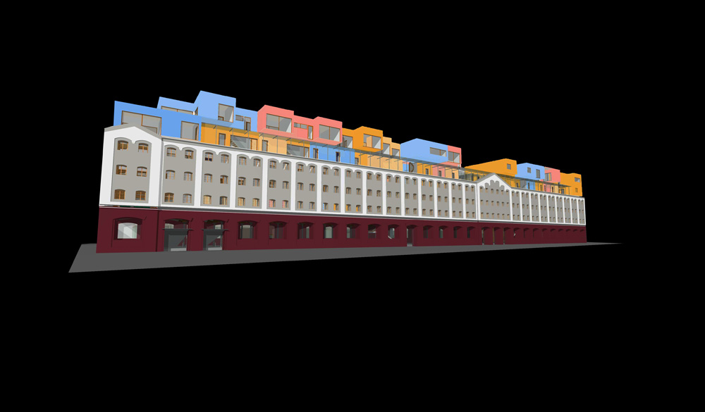
This granary can be understood as a structure from the “pre-packaging” era. It reminds us of a volume filling up with the material itself, which in turn occupies the entire structure; the volume becomes either a substance or empty space.
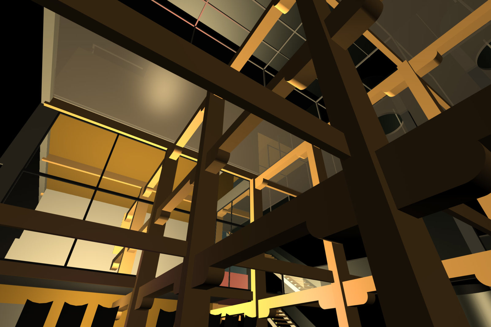
Layers
This structure was used to store agricultural products in their natural condition, that is, in their totality, in the original form rarely encountered today. We live in an era of hygienic packaging, in which the product is reshaped by marketing. When we shop, it is the logo or the packaging of the product that attracts our attention.
Choice, or an encounter with the unexpected, have become less and less common. Retail stores represent the endpoint in a long chain of transportation.
Structure
Today, a markedly different space is required; a granary is unlikely to survive in competition with the neighbouring buildings. It is not going to be merely an empty space for art installations, commercial shoots or a simple gallery. The building needs a continuous life of its own: people will move in and the place will come to life. Still, it’s soul and atmosphere should be preserved.
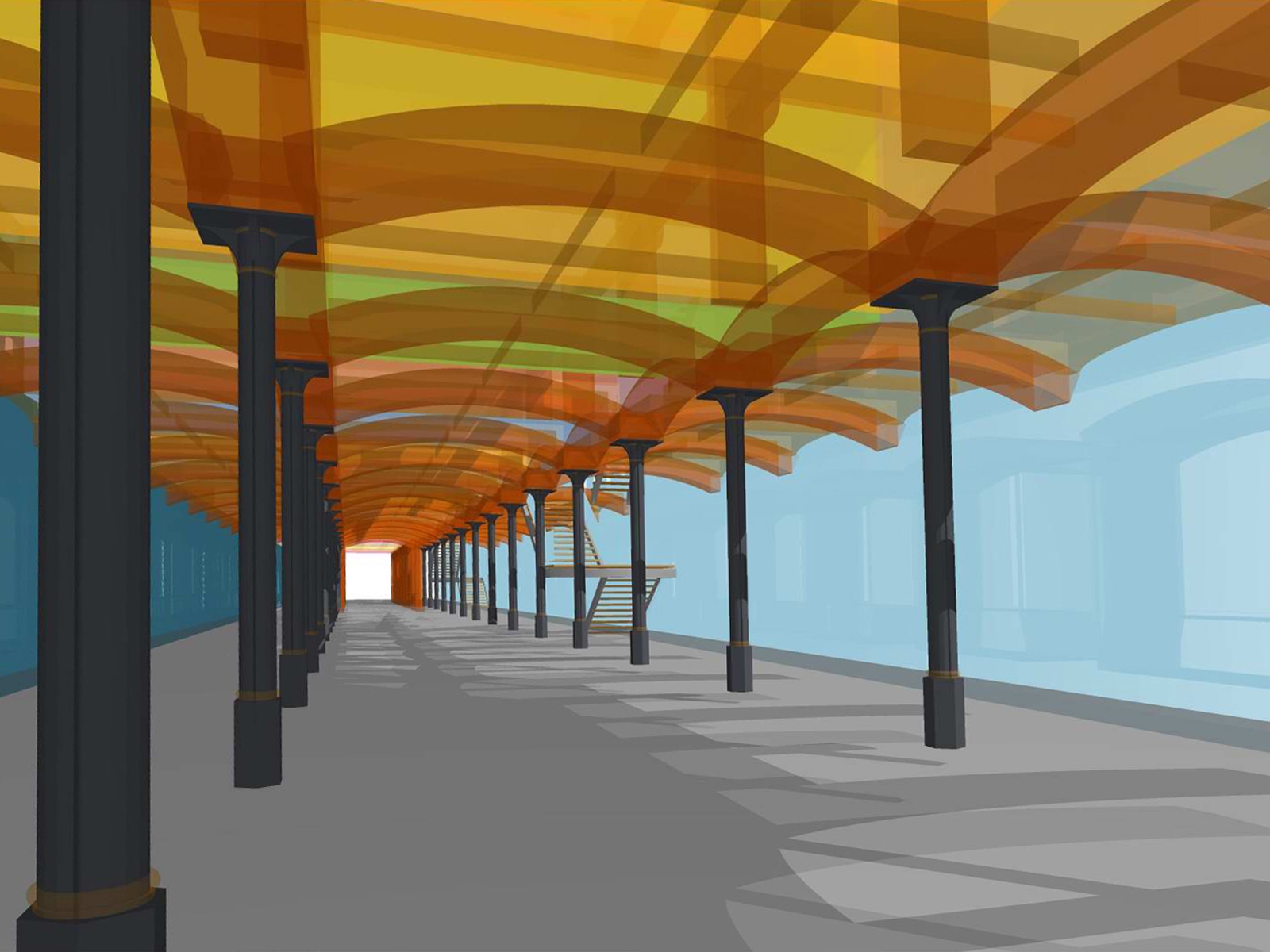
In this sense, I aimed to provide not only a construction-based solution, but also to offer a symbolic continuation of its present state, to grasp the spatial characteristics of the granary. That is, to support its unambiguous linearity, common to industrial buildings, and to decrease the feeling of low ceilings by breaking up the space.
The authentic construction of the historically and spatially interesting part of the building should not become a private stronghold, a mere ghetto in which to dwell. The wider public should be encouraged to participate in bringing the place to life.
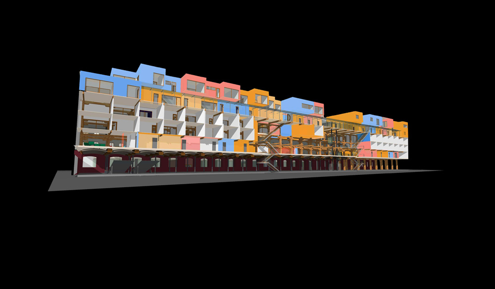
Both the entire ground floor and the interior of the gallery are open to the public, as are the atrium and cafes on the first floor of the granary. These rooms, however, also constitute an attractive part of the residences. Private or semi-private areas can be found in the residency quarter in the shape of interconnecting halls or garden patios.
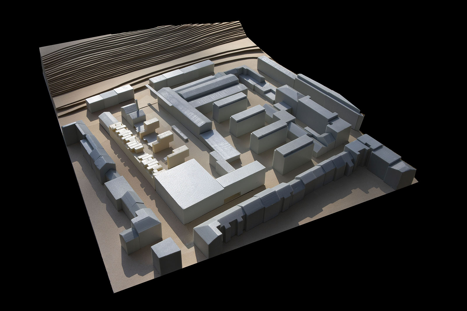
Harvest
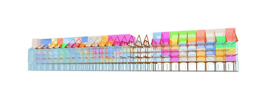
The structure has become home to salespeople, real estate agents, secret agents and Japanese tourists, although elements of its original character are still present. For example, the design proposes the principle of seemingly impermanent walls filling up individual modules of the granary structure: if a family moves out, or a larger family moves in, the position of the walls changes. The mass of one spills over into another.
The granary is now defined, the new content delimited. Space remains for the original wooden constructions, along with contemporary materials and last year’s harvest.
Developed within the Jiří Buček Studio, FUA TU Liberec, 20.1. 2003


